Project
1
Info
2
ToolsTrek.com
helps customers integrate various Atlassian and monday.com solutions, optimising business processes
My Role
UX/UI Designer
Timeline
4 month
Tools
Figma
Team
Web Developer
Co-founder and Head of expertise
Published at
Read
7 minutes
Oct 28, 2024
Overview
3
Challenges
Client's wishes
- Clarifying problem-solving: the previous version of the site lacks a clear structure outlining the specific problems that the company addresses
- Incomplete platform info: no updated information about the new platform
- Revised positioning: ToolsTrek is no longer just a partner of Atlassian and monday.com, but an independent IT consulting firm driving efficiency for clients.
- Keep the original illustrations and colours.
- Reduce the overall length of the site.
- Simplify and improve navigation.
- Make the design more approachable yet still professional.
Research
4
Company descriptors
Improvement Areas
- Information overload
- Content clutter
- Faceless illustrations
- Monotonous block design
- Platform over-promoted, not ToolsTrek
When I first encountered ToolsTrek, words like trust, professionalism, organisation, simplicity, energy, and friendliness came to mind. These qualities would guide the redesign.
Target audience
Place: Europe, USA
Sphere: retail, IT, finance, wholesale
People: COO, Technical Director
Motivation: business management problems
Target: earn more and faster
Sphere: retail, IT, finance, wholesale
People: COO, Technical Director
Motivation: business management problems
Target: earn more and faster
Competitors
ToolsTrek occupies a unique space. While other Atlassian and monday.com partners exist, none focus on consultancy to elevate business operations. This positions ToolsTrek as a leader in its niche.
Competitors
5

Sitemap
6

Redesign
7
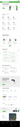
Homepage
On the homepage, it was essential to highlight information that differentiates the company from its competitors and clearly communicates its value to customers. The core strength of ToolsTrek lies in its team of experienced specialists, dedicated to helping businesses achieve new heights.
With this in mind, I prioritised text and clarity over illustrations. I incorporated orbital motifs into the background to subtly represent the range of services and solutions the company offers. The result? A clean, dynamic design.
With this in mind, I prioritised text and clarity over illustrations. I incorporated orbital motifs into the background to subtly represent the range of services and solutions the company offers. The result? A clean, dynamic design.
Homepage
Feature #1
8
Font
I switched from Roboto to Manrope. Both are sans-serif fonts, but Manrope’s rounded edges aligned better with the company’s modern logo, giving the site a clean, professional feel.
Font
Slide to see the difference 😉
Feature #2
9
Illustrations
The client provided over 100 custom illustrations, though none of the characters had faces. After reviewing studies showing that users connect better with illustrations that feature faces, I decided to add simple facial features to give the characters personality and improve their appearance.
Illustrations

Feature #3
10
Information Structure
After launching the first iteration of the website, we observed through testing that users often scrolled through the entire homepage before finding what they needed.
To address this, we redesigned the main navigation — introducing clear categories and structured submenus.
This change allowed users to access key sections instantly, improving overall navigation efficiency and reducing time to task completion.
To address this, we redesigned the main navigation — introducing clear categories and structured submenus.
This change allowed users to access key sections instantly, improving overall navigation efficiency and reducing time to task completion.
Information Structure


Home page comparison
11
Before / After
Before / After

Behind the Interface
12
Design System
A quick walkthrough of the ToolsTrek design system — from colours and typography to components and responsive layouts.
This system helped ensure consistency across the website and made collaboration with developers seamless.
This system helped ensure consistency across the website and made collaboration with developers seamless.
The client says
14
Positive feedback
The client expressed their satisfaction with our collaboration, with one of the co-founders leaving a positive review on LinkedIn.
Moving forward, we anticipate adding new platforms and further enhancing the site’s content and functionality, ensuring ToolsTrek continues to grow and engage more clients.
Moving forward, we anticipate adding new platforms and further enhancing the site’s content and functionality, ensuring ToolsTrek continues to grow and engage more clients.

Let's continue!
15
Dive into more projects
